
Mobile-first design isn’t hip in 2025—it’s standard. With more than 70% of all web traffic now generated by non-desktop sources, business and designers alike are migrating in masses to craft great mobile experiences first, thinking about desktop second. This shift involves more than a change in attitude, however; it involves reconsidering workflow, tools, and priorities.

So, from scratch and arriving at a clean, working product—how is this done? Let’s go through the whole mobile-first design process—starting with some initial wireframes and arriving at a production-quality mobile interface.
Why Mobile-First Is the New Default
To begin, the mobile-first process begins with the smallest screen. It encourages simplicity, prioritization, and clarity. By starting to build for mobile first:
- You prioritize your most important content and actions.
- You eliminate unnecessary overhead.
- You build a responsive base that resizes stunningly all the way down to desktops and tablets.
And, search engines such as Google give favor to mobile usability in their rankings—putting mobile-first not just as a design option, but as an SEO requirement.
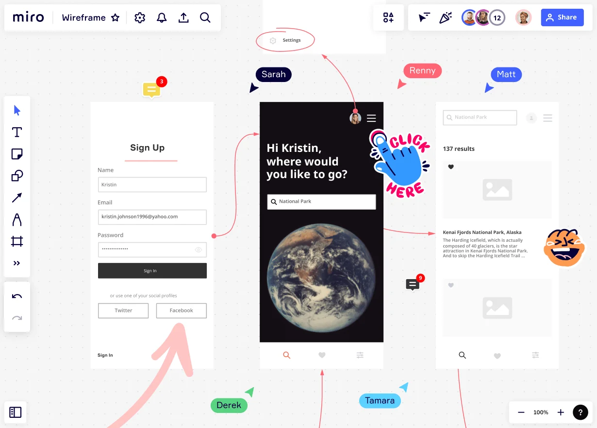
Step 1: Creating the Foundation with Wireframes
Design begins with low-fidelity wireframes, blueprints of structure and layout. In a mobile-first situation
- There’s only so much screen real estate to work with, so content hierarchy needs to be as clear as possible.
- Nav is optimized for usability—hamburger menus, sticky headers, tab bars, etc.
- CTAs are prioritized for tap-friendliness.
Recommended tools:
Figma, Adobe XD, Sketch (with mobile presets and collaboration features)

Step 2: Prioritizing Content & User Flow
Having established the wireframe basics, the next action is to wireframe the user flow. On the mobile, users like:
- Speed: less loading time
- Clarity: something on each screen
- Accessibility: bigger buttons, legible fonts, and simple forms
Therefore, designers must:
- Reduce friction through reducing steps
- Implement progressive disclosure (show more only when required)
- Implement visual hierarchy (color, size, spacing) to guide actions naturally
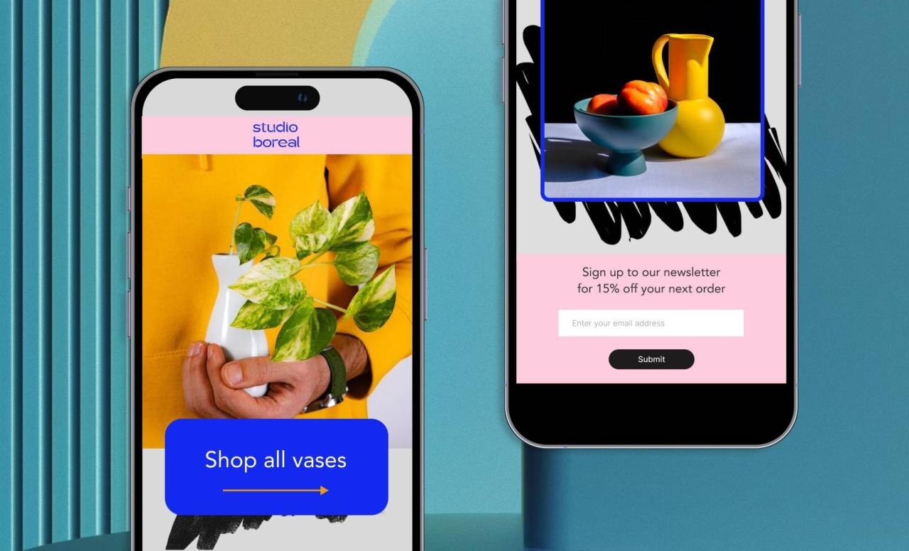
Step 3: Designing the UI with Mobile in Mind
Time now to include visuals. This phase transforms wireframes into high-fidelity mockups with real brand assets.
Must-know 2025 mobile design trends:
- Neobrutalism & Claymorphism for strong, haptic UI
- Dark mode & Dynamic themes for power efficiency and user choice
- Micro-interactions to quietly guide users with animation
Ensure your layout is thumb-friendly, especially for one-hand mobile phone users.
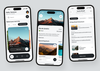
Step 4: Prototyping and Testing on Real Devices
A design that looks great on your computer screen will die or not work at all in a real phone. It is hence essential to:
- Test mocks directly on real mobile devices
- Conduct tap, scroll, and swipe usability tests
- Utilize interaction preview tools like InVision, Figma Mirror, or ProtoPie
Early feedback allows designers to iterate quickly and tune in for real use.
Step 5: Handoff and Development Collaboration
Once the last prototype is finalized, design is handed over to developers through tools like:
- Zeplin
- Figma Inspect
- Storybook (for design systems)
Design tokens are used by most teams by 2025 to connect design and code so that everything looks uniform across devices. Communication and documentation are important—so even now, documentation and communication are a must.
Designing for Mobile is Designing for the Future
Short answer: Mobile-first is no longer a choice. It puts your product out to find customers where they live—on their devices. Wireframed to shipped, the design takes empathy, focus, and attention to detail.
As behavior and technology continue to shift, the leaders in mobile-first thinking will stay ahead—serving up quicker, wiser, and more delightful user experiences.


