
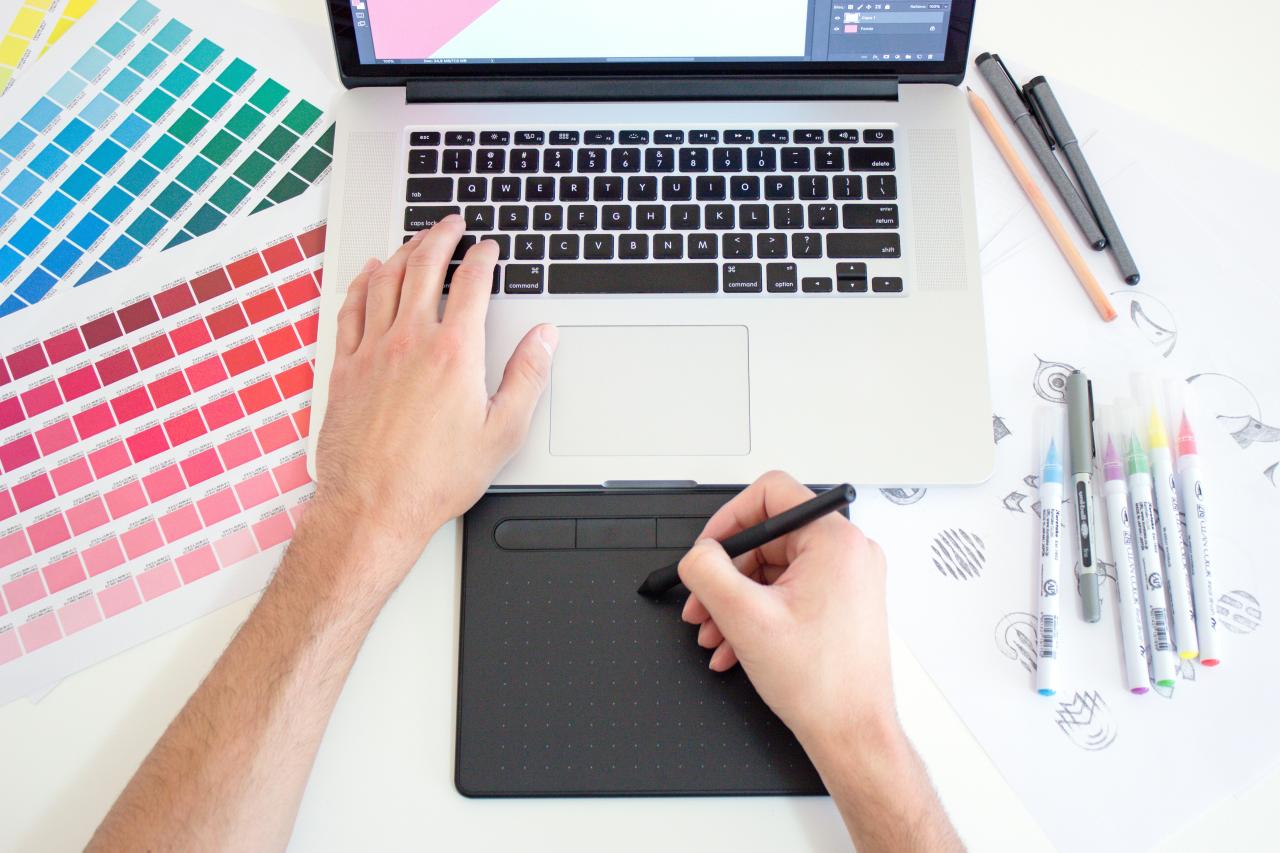
Ever created a flyer, social media graphic, or work presentation and felt like something was just… off? You can’t explain it, but it doesn’t look professional.

You’re not alone. Most of us aren’t trained designers, but we’re expected to create visual content that looks polished and communicates effectively.
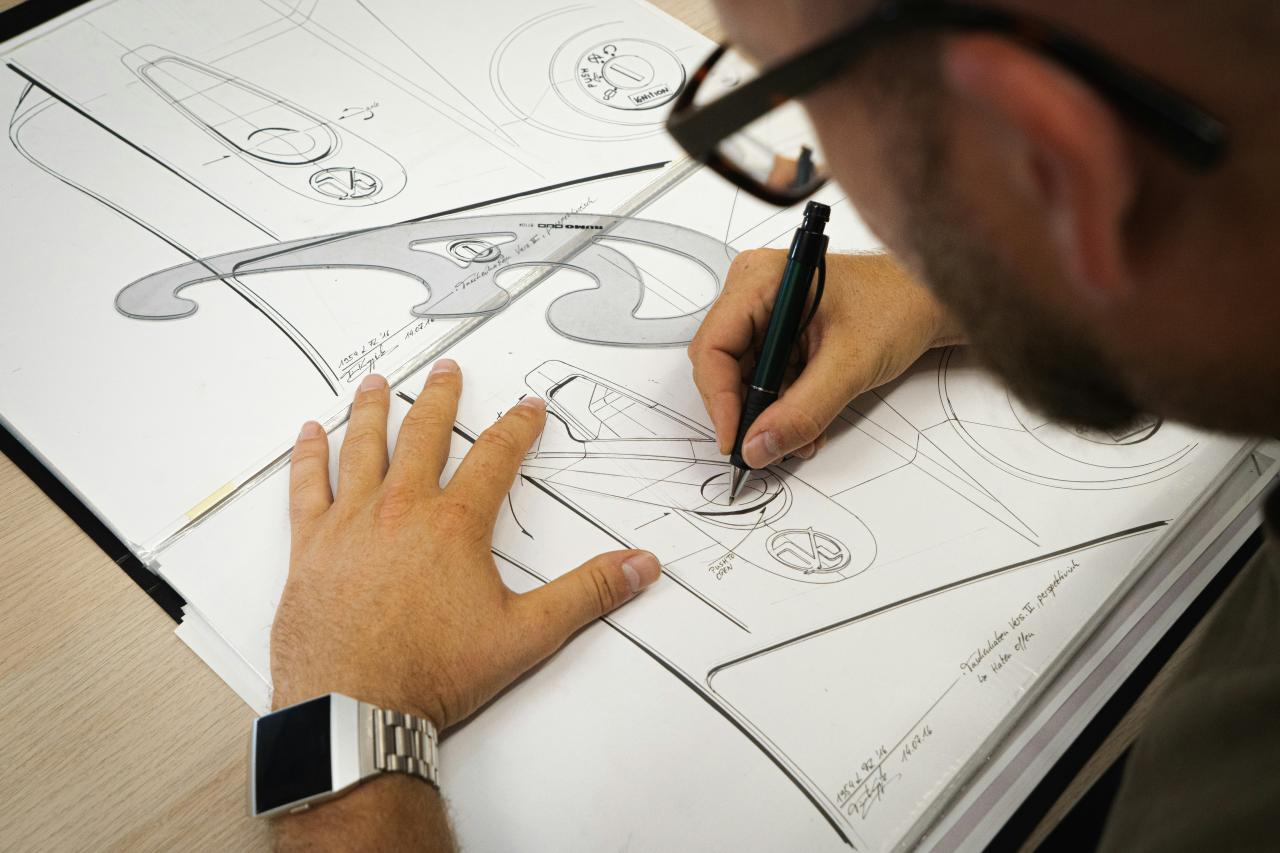
The good news? Graphic design isn’t magic – it’s a skill rooted in a handful of timeless principles. Once you know them, your work will instantly become clearer, cleaner, and more effective.
Here are 10 essential design principles every non-designer should keep in their back pocket.
1. Hierarchy: Show Them What’s Important First
At its core, hierarchy is about visual organization. It’s the art of making the most important element on the page look the most important. Our eyes are naturally drawn to things that are bigger, bolder, or in a different color.
In short, visual hierarchy shows viewers what to look at first. You do this by adjusting size, color, font weight, or placement.
Think of it this way: On a concert poster, the band’s name is usually the biggest thing you see. The date and venue are a bit smaller, and the ticket price might be the smallest. That’s hierarchy in action. It tells you what to read first, second, and third.
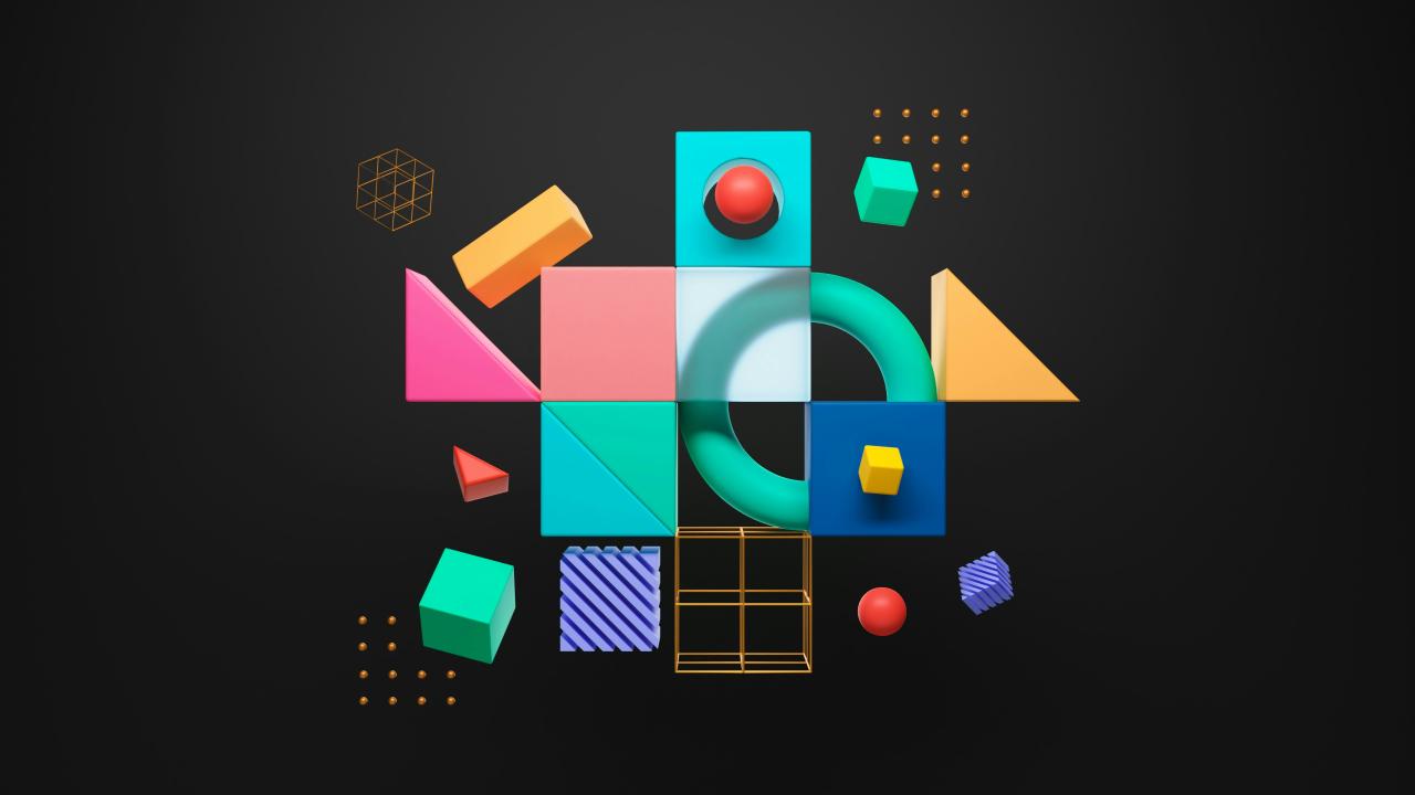
2. Contrast: Make Things Stand Out
Contrast is what creates visual interest. If everything on a page is the same size, shape, and color, it becomes a boring, unreadable mess. Contrast is what you use to make key elements pop. This can be achieved in many ways: light vs. dark colors, thick vs. thin lines, a modern font vs. a traditional one, or a large photo next to a small block of text.
A lack of contrast is one of the most common mistakes non-designers make. Don’t be afraid to make bold choices to draw attention where it’s needed.
3. Repetition: Create a Sense of Unity
Repetition is the simple act of reusing the same or similar elements throughout a design. This could mean using the same font for all your headings, the same color palette, the same shape, or the same stylistic element. Repetition is what ties a design together, creating a sense of unity, consistency, and cohesiveness.
A great example is a brand’s visual identity. They use the same logo, colors, and fonts across their website, social media, and packaging. This repetition makes their brand instantly recognizable and makes them feel more professional and trustworthy.
4. Proximity: Group Related Things Together
Proximity is a simple but powerful concept: items that are related to each other should be placed close together. Our brains naturally perceive items that are close to one another as a single group. This helps organize information, reduces clutter, and makes a layout easier for the viewer to understand.
On a business card, for example, your name, job title, and phone number are all huddled together. The company logo is off by itself. This grouping instantly tells the reader which pieces of information belong together.
5. Alignment: Bring Order to the Chaos

Alignment is about lining things up. It’s the invisible grid that connects elements on a page, creating a sharp, ordered, and intentional look. Nothing makes a design look more amateurish than random, floating elements. When every item is aligned with another item, the entire composition looks more connected and polished.
Whether you align text to the left, right, or center, be consistent. This simple act of organization brings a sense of calm and order to your design.
6. Balance: Distribute the Visual Weight
Just like a physical object, every element on a page has a “visual weight.” A large photo, a dark block of color, or a bold headline all feel “heavy.” Balance is the principle of distributing this weight so that the design doesn’t feel lopsided.
There are two main types:
- Symmetrical Balance: Elements are evenly distributed on both sides of a central axis, like a mirror image. It feels stable and formal.
- Asymmetrical Balance: A large, “heavy” element on one side is balanced by several smaller, “lighter” elements on the other. This often feels more dynamic and interesting.
7. White Space: The Art of “Nothing”
White space (or negative space) is simply the empty space between elements in your design. It’s the “breathing room” for your content. Many non-designers are tempted to fill every inch of the page, but this creates a cluttered and overwhelming experience. White space is not wasted space; it’s an active element that helps define and separate sections, create emphasis, and give the viewer’s eyes a place to rest. A little extra white space can make a design feel more open, elegant, and sophisticated.
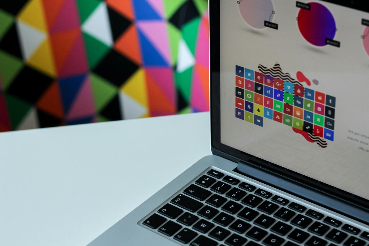
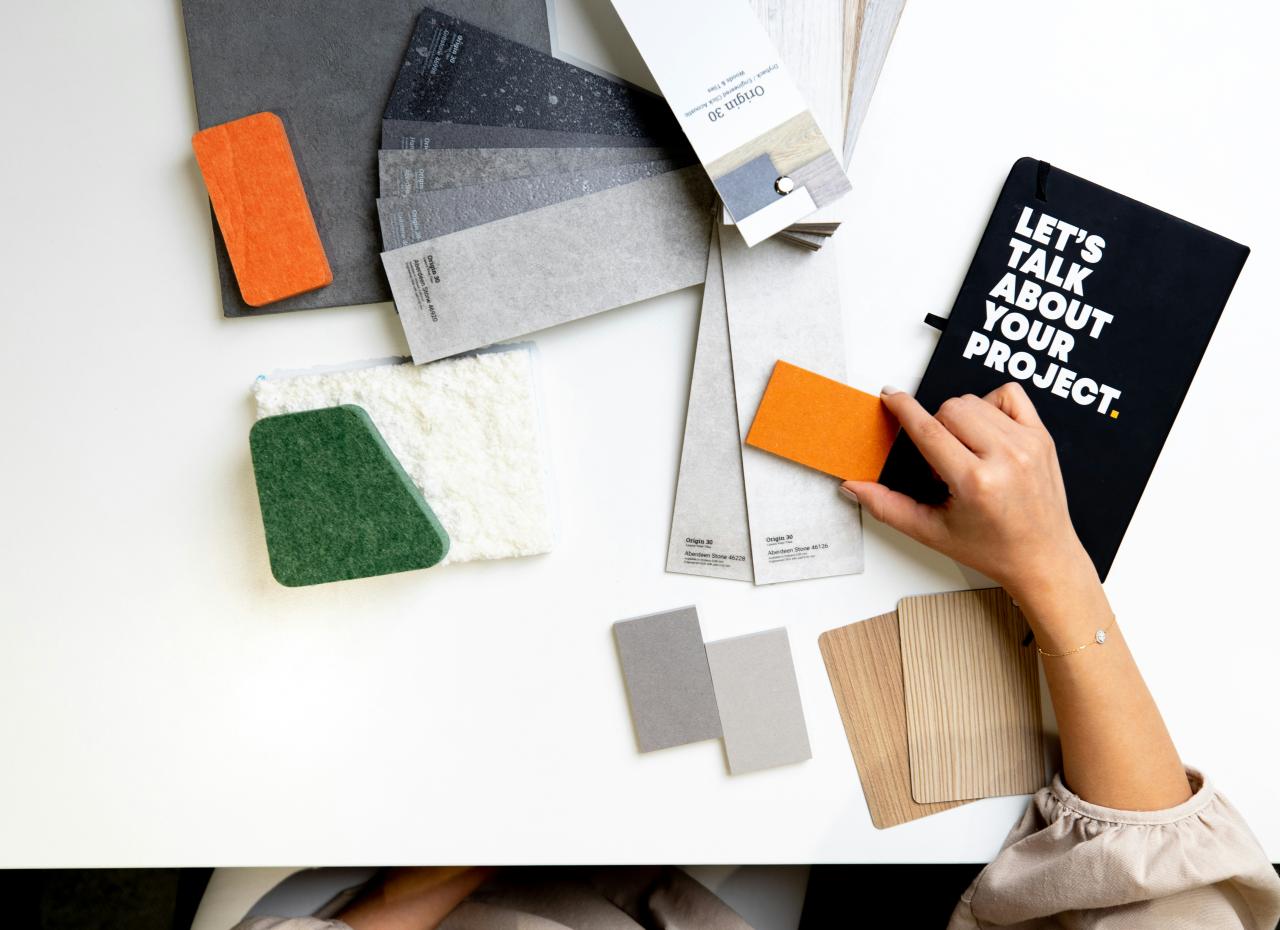
8. Color: Communicate with Emotion
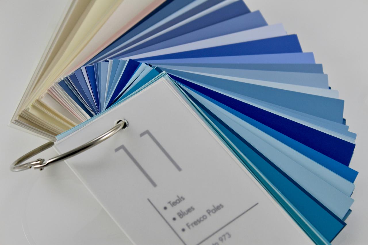
Color is one of the most emotionally resonant parts of design. It can set a mood, draw attention, and create a strong brand identity. A basic understanding of color theory can go a long way. Colors have temperatures (warm reds vs. cool blues), and different combinations (complementary, analogous) create different effects. The key is to use a limited, consistent color palette that supports the message you’re trying to send.
9. Typography: Text is a Visual Element
Typography isn’t just about choosing a font; it’s about how you present your text. The size, spacing, and font choice all have a huge impact on readability and the overall feel of the design. A good rule of thumb is to limit yourself to two or three fonts—one for headlines, one for body text. Ensure there is enough contrast between the text and the background to make it easy to read.
10. Movement: Guide the Viewer’s Eye
Movement is the principle of using elements to guide the viewer’s eye through the design, from the most important element to the least. This can be achieved through hierarchy, lines, shapes, and contrast. A well-designed page will have a natural flow that makes it easy for the audience to follow the intended path and absorb the information effortlessly.
You don’t need to be a master of all ten principles overnight. But by keeping them in mind, you can start making more intentional choices.
The next time you create something, ask yourself: Is there enough contrast? Are my items aligned? Is there enough white space?
Just thinking about these guidelines will put you on the path to creating visuals that are not only beautiful but also incredibly effective.


