


Just one mistake on your website or app can be enough for users to abandon it instantly. This happens because competition in today’s digital market is fierce — which means you need to make sure the user experience (UX) you offer is smooth, intuitive, and seamless.
You should never underestimate the importance of UX. When the user experience is disrupted — whether by confusing navigation, slow loading times, or broken forms — users will quickly turn to competitors.
Besides losing potential conversions or sales, these mistakes can also damage your brand’s reputation and trigger a negative snowball effect, where disappointed users share their bad experiences with others.
One of the most common mistakes designers make is failing to view a design from the user’s perspective. It’s easy to get caught up in trendy visual elements and assume users will automatically understand our creative vision.
However, when users visit your website, it’s crucial to understand what’s going through their minds: they should immediately know where to click, how to navigate, and what action to take next.
Remember this key principle — clarity always beats cleverness. A clear, easy-to-understand design will always outperform one that only relies on visual brilliance. But lack of empathy isn’t the only trap UX designers fall into. Let’s look at some other common UX mistakes that could be costing you users.
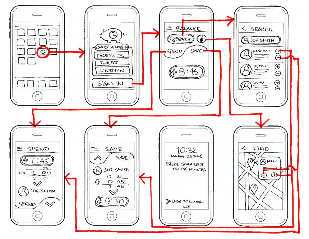
Ignoring Clear Navigation

This is one of the most fundamental UX mistakes — and one of the most damaging. When users can’t understand your content or how your app works, they’ll likely leave right away.
Confusing navigation, unclear instructions, and hard-to-find menus create frustration that drives users away within seconds. The rule is simple: if users have to think too hard to find what they’re looking for, your design has already failed.
Citing the site Uitop, the case of the SaaS platform Slabstack. While the platform offered powerful tools for effective customer relationship management (CRM), these vital features were buried under dozens of randomly placed submenus on the main dashboard.
As a result, new users struggled to find key functionalities. Leading to poor interaction, high frustration, and an increased workload for the support team. Who had to constantly assist users in navigating the chaos.
This serves as a reminder: no matter how great your features are, they mean nothing if users can’t find them.
To fix this, the Slabstack dashboard was completely restructured. The design was simplified and made more intuitive, with frequently used tools placed front and center. The interface was also made modular, allowing users to access sections that fit their needs more easily.
Not Being Mobile-Responsive
In today’s market, neglecting mobile responsiveness is one of the biggest UX mistakes you can make. Data shows that mobile devices account for the majority of global web traffic — meaning poor mobile optimization instantly becomes a major source of frustration for users.
When your site or app doesn’t function properly on smartphones, your business faces higher bounce rates and lost revenue from customers who rely on their phones for almost everything. If your design only looks great on a desktop screen, you’ve already lost the game before it begins.
Instead of designing for desktop first and then shrinking it down, start with the smallest screen — the mobile view. This approach lies at the heart of responsive design.
First, avoid using fixed pixel units (like width: 600px). Instead, use flexible units like percentages (%), em, rem, or vw/vh. This ensures elements resize proportionally across different screen widths.
Second, make sure your HTML includes the correct viewport meta tag to tell browsers to scale the page according to device width.
And most importantly, remember that good mobile navigation demands simplicity and accessibility.
You can use a hamburger icon (three horizontal lines) to hide secondary menu options while keeping the interface clean — but make sure all icons are universal and easy to understand.
Lastly, for better comfort and usability, prioritize key navigation items (like Home or Search) by placing them in easily reachable areas — ideally on a bottom navigation bar within thumb’s reach.


