
Your logo isn’t just a picture—it’s the face of your brand. Whether you’re starting a tiny online shop, building out a personal portfolio, or running a fast-growing business, your logo follows you everywhere. Website, Instagram, packaging, business cards—people see it before they know anything else about you. That’s why you can’t treat logo design like a quick side project. This is about making smart choices, not just pretty graphics.

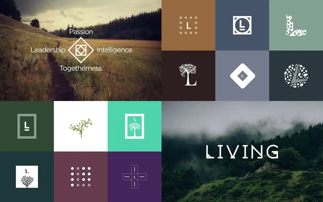
Start With Clarity, Not Just Creativity
Before you even start sketching, pause. Ask yourself—what’s this brand all about? Who are you talking to? What do you want people to feel when they see your logo? A tech startup’s logo should say something totally different than a cozy neighborhood bakery’s. If you know your brand’s vibe—modern, playful, elegant, bold—you’ve already done half the work. Creativity needs a purpose, otherwise you’re just making random art.
Keep It Simple and Memorable
Think about the logos you actually remember. They’re not complicated. Simple logos stick in your mind and work everywhere—from a tiny app icon to a giant billboard. Clean designs look good in black and white, shrunk down, or blown up. So, cut the clutter. Too many colors, fonts, or shapes make things messy. Focus on one strong idea and build around it. A great logo isn’t about showing off—it’s about being clear and feeling right.
Pick Your Colors and Fonts With Intention
Colors hit people on an emotional level. Blue means trust. Red shouts energy. Green hints at growth or eco-friendliness. So, pick colors that match your brand’s message. Fonts matter just as much. A heavy sans-serif font feels modern and bold. Serifs bring a classic, timeless vibe. Stick to one or two fonts—otherwise, things get chaotic fast. When you nail the right color and typography, your logo pops without being over-the-top.
Make Sure It Works Everywhere
Your logo needs to hold up in the real world. It should look sharp on a website, fit neatly on social media, and still be recognizable on a pen or a T-shirt. Try it out in different sizes and on different backgrounds. Can you read it from across the room? Does it get blurry or confusing when it’s tiny? If your logo works everywhere, you’re set up for growth.
Be Original—Not Just Trendy
Trends are fun, but they fade fast. If you chase whatever’s popular right now, your logo might look outdated next year. Look at what others are doing, sure, but don’t blend in. Figure out what makes you different and put that front and center. Sometimes, mixing two basic ideas leads to something new. Don’t be afraid to experiment and sketch a bunch of rough versions before you settle. The best ideas usually sneak up on you.
Final Thoughts
Making a logo that stands out isn’t just about being clever or artsy. It’s planning, understanding your brand, and focusing on what matters. Keep things simple. Choose your colors and fonts with care. Test it everywhere. Most of all, be real.
A great logo does more than look cool—it tells people what you’re all about. When you get that right, people notice, and more importantly, they remember you.


